Stop Context Switching: Dashboards Connected to Your Kubernetes Architecture
It’s 2 AM. Your phone buzzes, alerting you to a latency spike on the checkout service. You’re already awake so muscle memory kicks in and you’re already opening Grafana.
You spot the spike on your Grafana dashboard staring back at you. It’s a line going up, completely devoid of context.
Immediately, you jump to another tab for kubectl hunting for the right pod, muttering, “which namespace was it again?” Once you have the pod name, you rush to your log aggregator, paste it in, and adjust the time range. Wait, is this UTC or local time?
Back to Grafana you go, trying desperately to line up the timestamps manually. Was that critical memory spike at 2:03 or 2:04?
This frantic multi-tab shuffle is the painful reality of modern debugging. You’ve become the “integration layer” for tools that refuse to talk to each other.
The hardest part of debugging isn’t finding the data; it’s connecting it.
We’re excited to release Dashboarding for SUSE Observability. It’s our most requested feature, designed specifically to close the context gap. Instead of isolated data points, imagine a dashboard fundamentally connected to your system topology.
Dashboards Connected to Your Architecture
SUSE Observability Dashboarding isn’t just another charting tool. It’s topology-aware. Every widget links directly to the components in your architecture. No datasource configuration, no plugin management, no separate login.
Stop managing dashboards. Start using them.
The difference is in the details. Every widget links back to its data source. That time series showing memory usage? Click the link and you’re looking at the pod in your topology. Neither a query builder, nor a search box, but the actual component with its health state and related services.
The Workflow: Build Context, Don’t Just View It
Most dashboards are destinations. You go there to look at data. SUSE Observability dashboards are workflows. You build them as you investigate.
The Pin-to-Dashboard Workflow
You’re investigating a latency spike on the catalog service. While looking at the component, you notice memory usage correlating with the spike: a jump from 1.2GB to 1.8GB right when HTTP latency hits 340ms. One click to pin the metric. Another click to add it to a dashboard. You keep investigating, pinning more metrics as you go.
By the time you’ve found the root cause, you’ve built a War Room. Not a room full of panicked engineers, but a shared view that captures the entire investigation. Tomorrow’s post-mortem practically writes itself. The dashboard becomes a record of what you found, not a static display you hoped had the right charts.
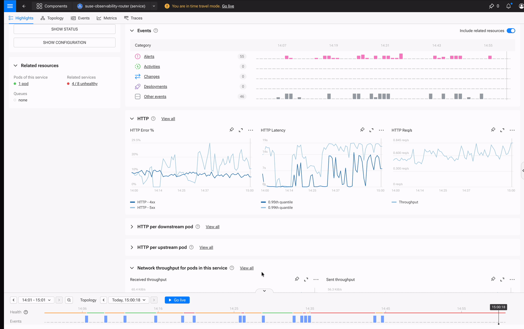
Time Travel is More Than a Time Range Selector
This is where SUSE Observability dashboards fundamentally differ from Grafana.
When your VP asks “What happened at 2:47 AM?”, you don’t scrub timelines hoping to line things up. You freeze the entire system (topology, health states, metrics) at that exact moment. Time Travel isn’t just a time range picker. It’s state preservation.
- View your dashboard at any historical point, with the topology state from that moment
- Share the exact instant with colleagues: “Look at 2:47 AM when the spike happened”
- Everyone sees the same context, the same health states, the same component relationships
No Slack thread asking “Are you looking at UTC or local time?” No manual correlation. The system preserves what your infrastructure looked like at any point in history.
One Platform, No Assembly Required
Grafana is excellent at visualization. If you need 50 widget types or highly specialized visualizations, it’s still the right tool for that job.
But for troubleshooting and cross-component visibility? You no longer need a separate tool.
| Aspect | Typical Approach (Grafana) | SUSE Observability |
|---|---|---|
| Setup | Configure datasources, manage plugins | Built-in, just works |
| Context | Charts are isolated | Widgets link to topology |
| Troubleshooting | Separate workflow | Integrated pin → dashboard |
| Time Travel | Manual time range selection | System-wide state preservation |
| Maintenance | Another tool to manage | Part of the platform |
The real cost of “build it yourself”:
The typical DIY stack:
- Prometheus for metrics
- Elasticsearch for logs
- Jaeger for traces
- Grafana to tie all the above together.
Each tool has its own data model and its own query language. Grafana can visualize all of them, but it can’t correlate them.
SUSE Observability is different. Metrics, logs, traces, and topology live in one platform, correlated, by default. When you build a dashboard, you’re visualizing data that’s already connected to your component relationships.
Five widget types (Time Series, Bar Chart, Stat, Gauge, and Markdown), purpose-built for the job. Full PromQL support with auto-complete. Variables for dynamic filtering. Every widget is automatically linked to its source component.
Real-World Use Cases
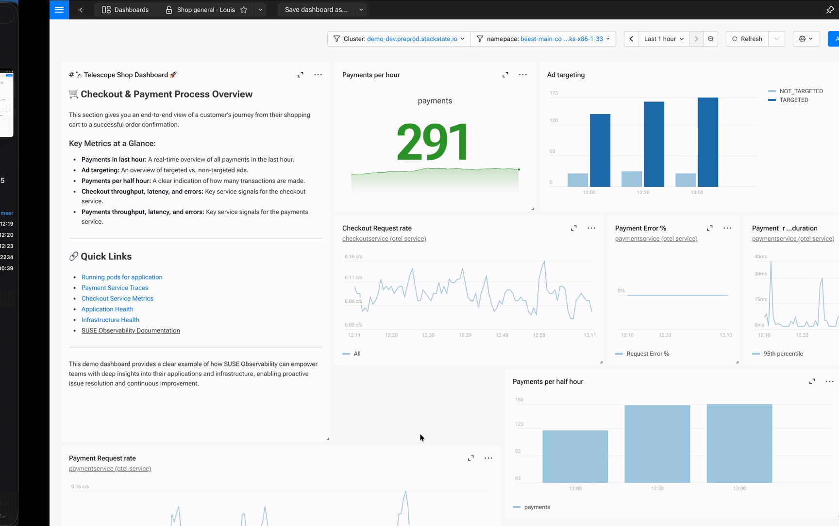
Use Case 1: The Technical Dashboard
You’re the engineer responsible for the payment service. The one that processes every transaction and touches half the microservices in your stack. When payment latency creeps up, customers abandon carts. When it goes down, revenue stops.
You need a single view that answers: “Is payment healthy right now?” Without opening five tabs.
In SUSE Observability, you create a new dashboard and start adding widgets manually. Request rate and response times are straightforward—add a Stat widget, add a Time Series widget, write your PromQL queries. But for CPU usage, you don’t want a chart with 47 lines for every pod in the namespace. You want the top offenders.
So you add a Time Series widget and write a query using topk():
topk(5, sum by(pod_name)(rate(container_cpu_usage{namespace="${namespace}"}[5m])))This gives you the top 5 pods by CPU usage—the ones actually worth watching. The chart stays readable, and when one of those pods starts climbing, you’ll see it immediately.
Your finished dashboard:
- Stat: 847 requests/second, current throughput at a glance
- Time Series: Response times over the last hour, with threshold lines at 200ms and 500ms
- Time Series: Top 5 pods by CPU usage (the query above)
- Gauge: Memory at 73% of limit (orange means watch it, red means act)
You use a ${namespace} variable, so the same dashboard works across dev, staging, and production. Each widget links back to the actual pod in your topology—so when you see a spike, one click takes you to the component, its logs, and its traces. No context switching required.
Use Case 2: The Business Dashboard
Your VP keeps asking: “Are checkouts healthy?” They don’t care about pods or namespaces. They care about revenue.
So you build them a dashboard, not in a separate BI tool, but right in SUSE Observability where the data already lives. You pull checkout metrics from the order service, payment success rates from the payment gateway, and latency from the inventory check. Because SUSE Observability already understands how these services connect, you’re not wiring up datasources or writing complex joins. You’re just selecting the metrics that matter to the business.
The result:
- Stat: “1,247 successful checkouts in the last hour” (the number they actually care about)
- Time Series: Checkout success rate over time (currently 99.2%)
- Gauge: Payment gateway latency at 89ms, well under the 200ms threshold
- Markdown: Links to technical dashboards for cart, payment, and inventory services
Now when the success rate dips, your VP doesn’t ping you on Slack. They click the markdown link to the payment service dashboard, see the technical view, and understand the impact. Same platform, different lens.
Use Case 3: The Incident War Room
It’s 2:43 AM. Alerts fire on the catalog service. You open SUSE Observability, navigate to the component, and see memory climbing fast.
Here’s where the workflow changes everything: instead of copying metrics to a notepad or screenshotting Grafana, you click “Pin to Dashboard” and select “New Dashboard.” You name it “Catalog Incident 2026-01-15” and keep investigating.
You check HTTP latency on the same pod—there’s a 340ms spike correlating with the memory climb. Pin it. You pull up the error rate. Pin it. Each pin takes one click. Within three minutes, you’ve built a War Room view:
- Time Series: Memory spike on catalog-service-7d4f8b, jumped from 1.2GB to 1.8GB at 02:43
- Time Series: HTTP latency on the same pod, 340ms spike correlating with memory
- Stat: Error rate hit 2.3% during the incident window
- Markdown: “Root cause: OOM pressure from uncached product queries. Fix deployed 02:58.”
Shift-click on the memory spike to drop a time marker—it appears across every widget, so you can visually confirm the correlation. Share the dashboard URL with your colleague. They see exactly what you see, at exactly the same moment in time.
The dashboard isn’t just a view. It’s your incident record: shareable, time-travel-enabled, and permanently linked to the components involved. Tomorrow’s post-mortem writes itself.
Get Started
Dashboarding is available now in SUSE Observability.
→ Explore dashboards on the playground to see topology-aware dashboards in action, no setup required
→ Read the documentation to build your first dashboard in 5 minutes
Already a customer? Open SUSE Observability, click “Dashboards,” and start building.
Your engineers deserve more than scattered views. Give them dashboards connected to your architecture.
Related Articles
Apr 03rd, 2025
Understanding Kubernetes Security Basics And Best Practices
Sep 22nd, 2025
New Support Experience: Going Live Soon!
Nov 11th, 2025